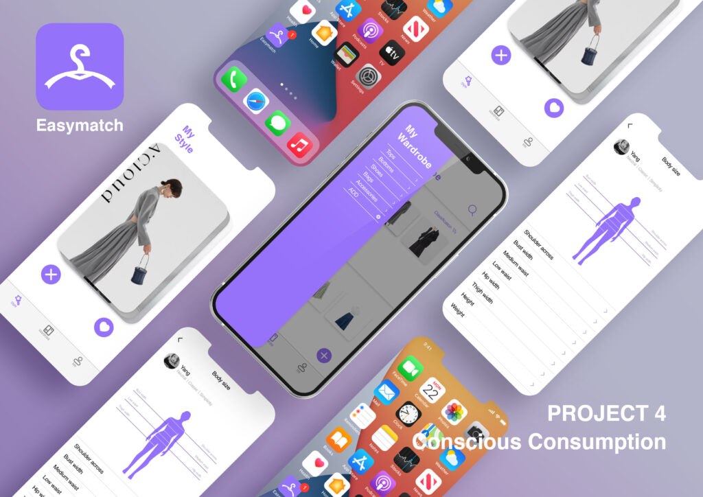
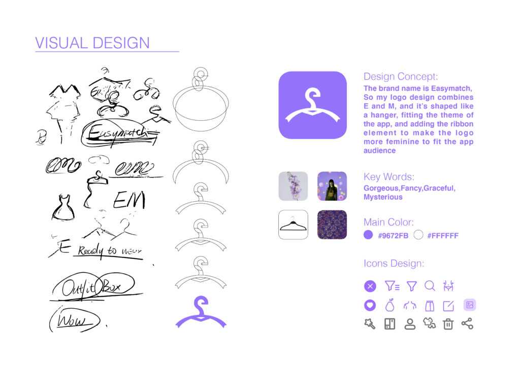
The brand name is very simple, combining the two words easy and match, because I hope my product can help young girls find their favorite and suitable clothes in an easier way, and they can learn to increase the utilization rate of their clothes to reduce their purchases. Conscious consumption will make their lives easier and more energetic. The brand name is Easymatch, so my logo design combines E and M, and it’s shaped like a hanger, fitting the theme of the app, and adding the ribbon element to make the logo more feminine to fit the app audience. The reason why I chose purple with high saturation and low brightness as my main color is that I want to convey Young, Gorgeous, Fancy, Graceful, Mysterious keywords.
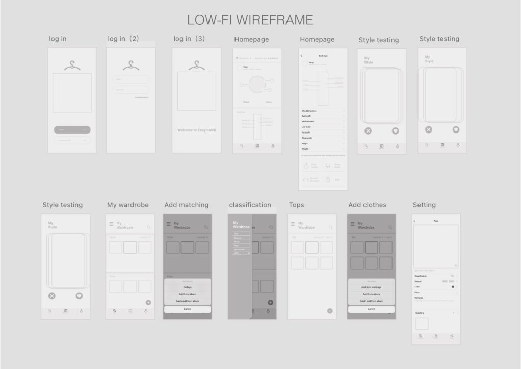
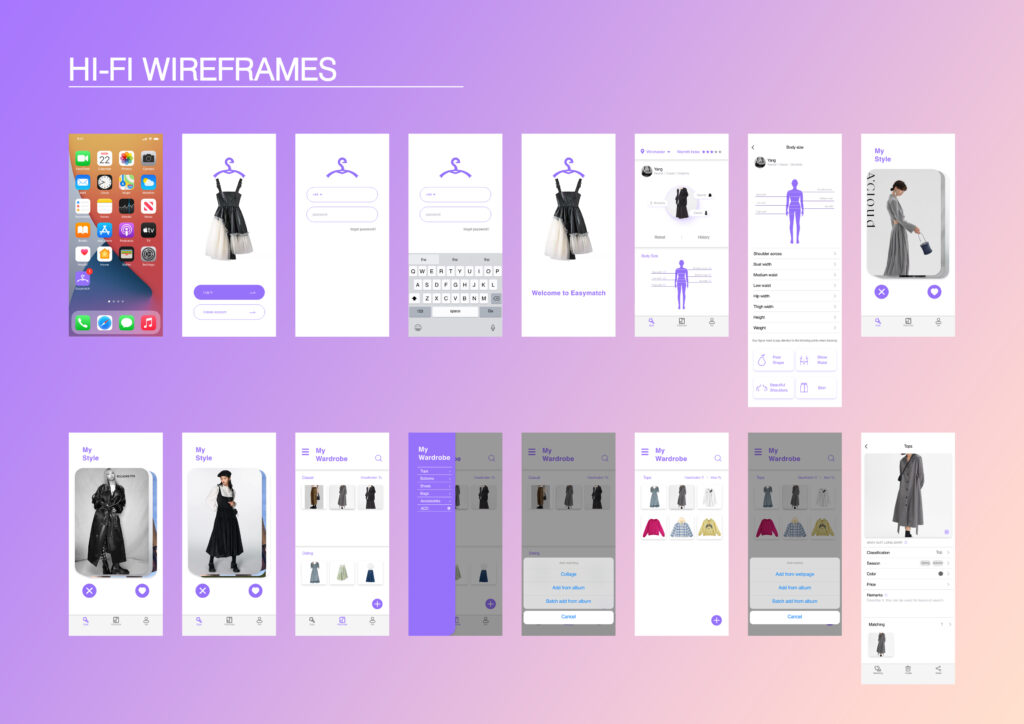
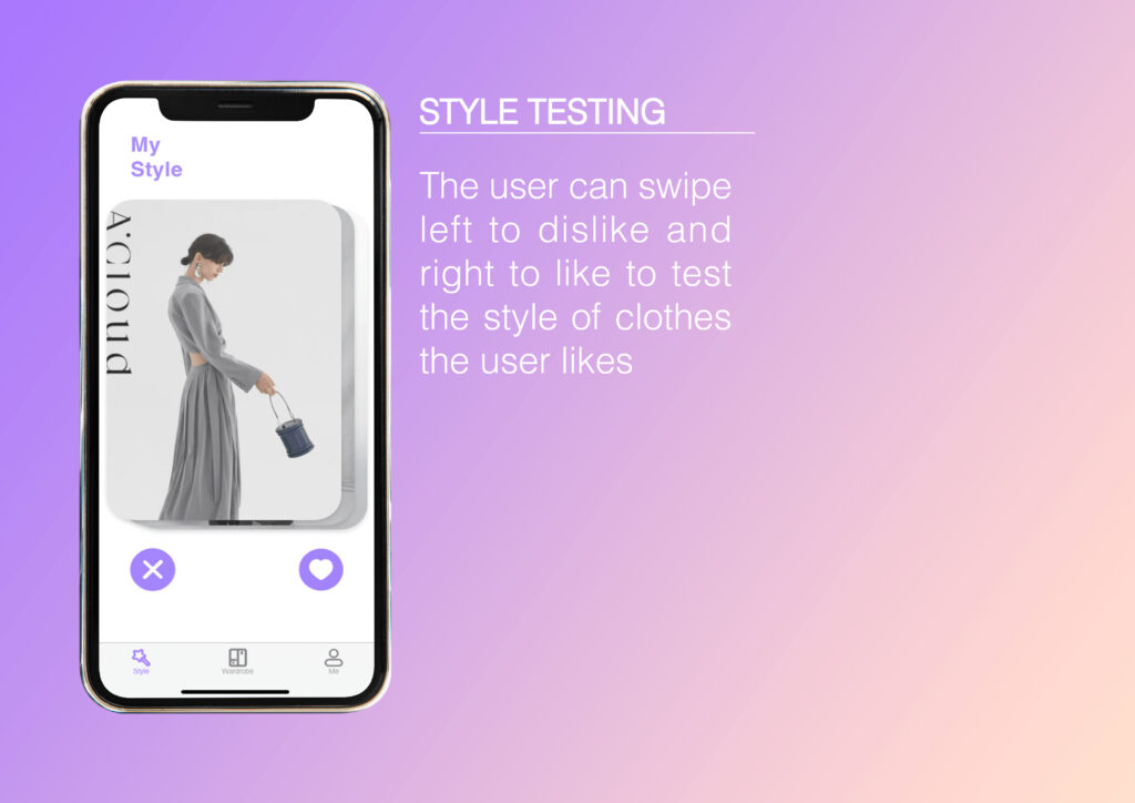
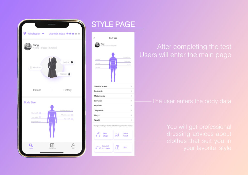
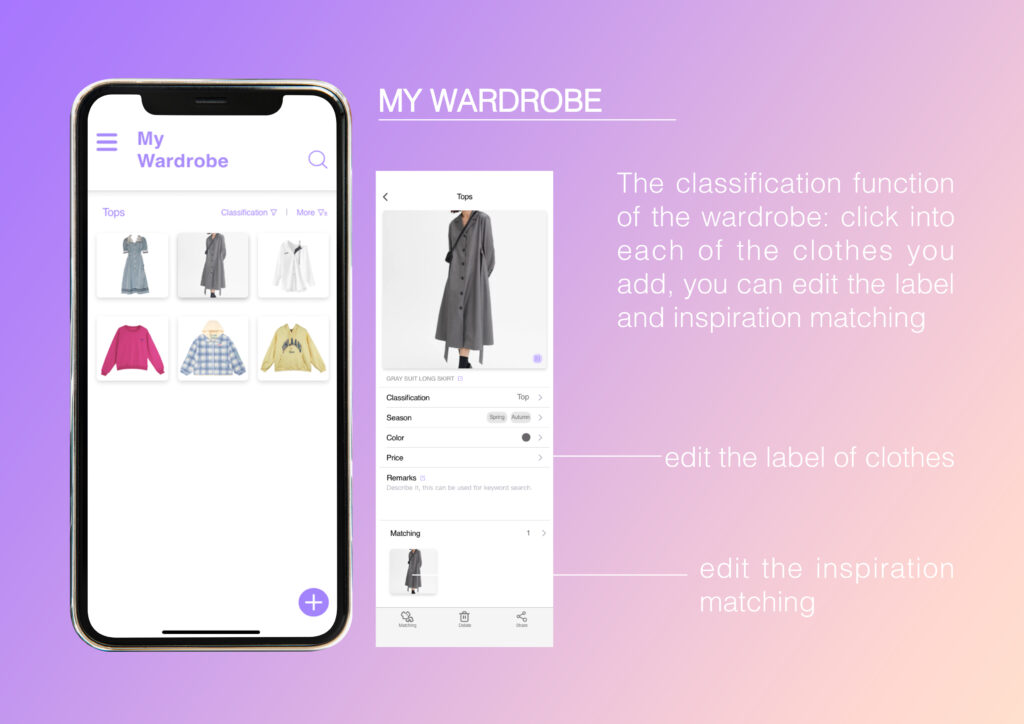
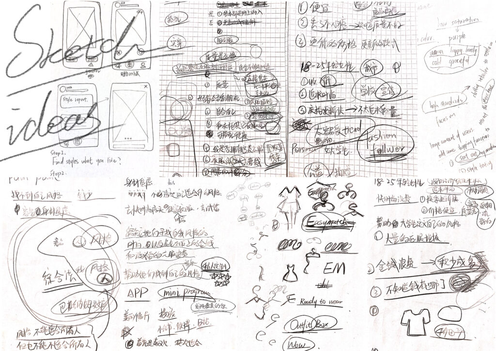
And There are two main functions in the user interface, style testing and sorting out the wardrobe.